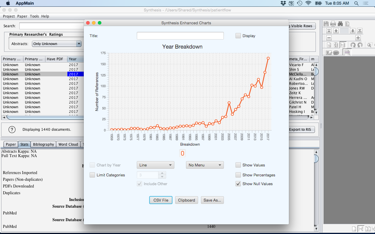
View Enhanced Charts
The contents from the selected column will be displayed in the Enchanced Chart visualization tool. This allows the data to be displayed in several chart formats including Pie, Line, Bar, Stacked Bar, and Stacked Area chart.
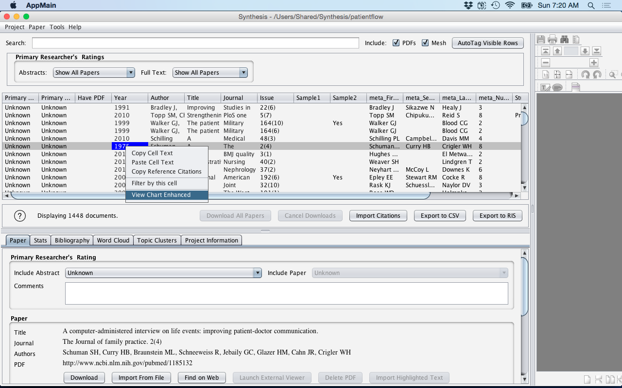
- Select the cell that you want to chart (i.e. have a graphical display of the contents).
- Then Right Click on the cell, you will then see a drop down list.
- Click (left) on the option 'View Chart Enhanced'
Figure: Right Click - View Chart Enhanced
- This will now launch the Synthesis Enhanced Charts window.
- The Enhanced Charts interface has many parameters that may be manipulated to examine the data in different ways in a graphical format (see Chart Manipulation Functionality table).
- The Chart created can then be saved as either a PNG file or by copying it to the
Clipboard where it can be inserted (CTRL-V) into applications such as Microsoft
Word or Microsoft PowerPoint.
Figure: Charts2
| Description | |
|---|---|
| Title | Allows the Title of the chart to be changed. The Display checkbox will either enable or disenable this change to occur. |
| Chart Types | Several Charts Types are provided. Each chart type may have its own unique properties that makes visualizing the data in this format more presentable (i.e. understandable). The Chart Types provided are: Pie, Line, Bar, Stacked Area, and Stacked Bar. |
| Chart by Year | Allows the data to be broken down by reference Year. This option is good to see trends over time. It is best used with a Line or Stacked Area chart type. |
| Menu | Displays the Menu (i.e. description of the Data categories) and where it should appear on the chart. Options include: No Menu, Left Menu, Right Menu, Top Memu, or Bottom Menu. |
| Show Values | Displays the values associated with a Data category. (note: Pie Chart only) |
| Show Percentage | Displays the percentage associated with a Data category. (note: Pie Chart only) |
| Show Null Values | Includes the Null (i.e. missing values) in the Chart. |
| Limit Categories | Allows the option to only display the top (i.e. most frequent) Data Categories as defined by the user through the number interface Less frequent Data Categories (i.e. those Data Categories not making the Top X) are then assigned ot the "Other" category. This feature is used in conjunction with the "Include Other" checkbox - which will either include or not include the Other Data category in the chart displayed. |
| Button | Description |
|---|---|
| CSV File | Allows the Data to be saved as a CSV file. |
| Clipboard | Allows the Chart to be saved to the clipboard so that it can be pasted (i.e. CTRL-V) into another application such as Microsoft Word or Microsoft PowerPoint. |
| Save As... | Allows the Chart to be saved as a PNG file. |